performative-ui: A Satirical Component Library for the AI Hype Era
Published on June 17, 2026 by Wasim
What Is performative-ui?
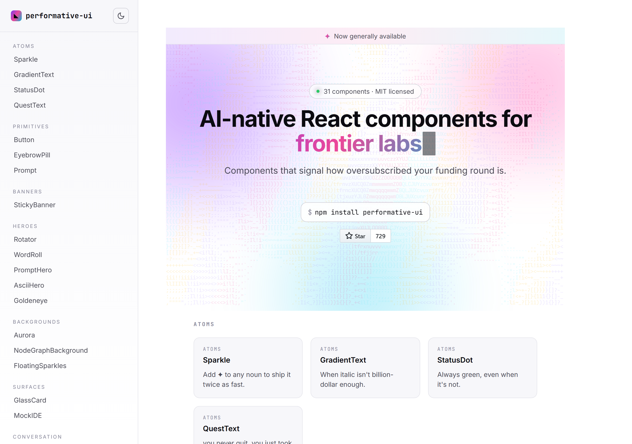
performative-ui is a React component library with one of the sharpest taglines in open source: "AI-native React components that signal how oversubscribed your funding round is." It is, gloriously, a joke — and also a fully working, MIT-licensed, 31-component library you can actually npm install.
Built by vorpus, it parodies the visual language every AI startup landing page has converged on: the gradient hero, the aurora blob background, the rotating list of everything-the-product-does, the glowing middle pricing tier, and the waitlist form for demand you manufactured yourself. The docs site sums up the value prop perfectly: "Components that signal how oversubscribed your funding round is."
If you have shipped a landing page in the last two years, this library is going to feel uncomfortably familiar.
The Joke That Actually Compiles
What makes performative-ui work is that it is not a Figma mockup or a Twitter thread — it is real, strict TypeScript, built with Vite, targeting React 19+, in roughly a 30KB bundle. The satire lands precisely because every component is production-grade. You could ship these to real users. That is the uncomfortable part.
npm install performative-ui
The component descriptions are where the writing shines. A few highlights from the docs, quoted verbatim:
- Sparkle — "Add ✦ to any noun to ship it twice as fast."
- GradientText — "When italic isn't billion-dollar enough."
- StatusDot — "Always green, even when it's not."
- Button — "We made the button move so you'd click the button."
- PromptHero — "We replaced the value prop with a text input."
- Aurora — "Three blobs and a generation defined."
- PricingCard — "The middle one is glowing. Choose accordingly."
- WaitlistForm — "Demand we manufactured ourselves."
The Component Taxonomy
The 31 components are organized into categories that read like a field guide to modern AI marketing. Here is the full taxonomy:
- Atoms — Sparkle, GradientText, StatusDot, QuestText
- Primitives — Button, EyebrowPill, Prompt
- Banners — StickyBanner ("Funding news disguised as utility.")
- Heroes — Rotator, WordRoll, PromptHero, AsciiHero, Goldeneye
- Backgrounds — Aurora, NodeGraphBackground, FloatingSparkles
- Surfaces — GlassCard ("Backdrop-filter: ambition."), MockIDE
- Conversation — ChatBubble, TokenStream, WibblingSpinner, ChatFAB
- Social Proof — LogoMarquee, LogoRow, SlippyWords, StatCounter, CommunityBadge
- Pricing & Conversion — PricingCard, BeforeAfter, WaitlistForm, Popover
A personal favourite is TokenStream, whose description is a genuinely good piece of web-history trivia: "Server-sent events (SSE) were added to the HTML5 spec in 2008 but never used until 2025." The SSE standard really did sit mostly idle until the streaming-LLM era gave it a reason to exist.
Why It's More Than a Gag
Underneath the satire, performative-ui is quietly useful in three ways:
- It's a pattern catalog. If you genuinely need a gradient hero, a logo marquee, or a glowing pricing card, the implementations here are clean, typed, and dependency-light. Read the source; the GlassCard
backdrop-filterwork and the TokenStream handling are reference-quality. - It's design criticism in code. Naming the components after the manipulation they perform — "Built for conversion, not consent" (Popover), "Numbers that go up are better than numbers that don't" (StatCounter) — is a more effective critique of dark patterns than any blog post.
- It's a portability demo. There is already a community Svelte 5 port, which tells you the patterns generalize beyond React.
How to Read It (and Use It Responsibly)
The honest takeaway: enjoy the jokes, then notice how many of these components are sitting on your own roadmap. The library is a mirror. A glowing middle pricing tier and an always-green status dot are funny in a parody repo and dishonest in production — the difference is entirely in intent.
If you want to build the real, substantive parts of a landing page instead of the performative ones, that is where small, focused utilities help. While prototyping copy and markup, a quick Markdown to HTML converter turns your draft sections into clean markup, and a Theme Color Token Customizer helps you design an honest palette — no aurora blobs required.
Final Thoughts
performative-ui is the rare project that is funny, well-engineered, and quietly instructive all at once. It captures a very specific moment in software — when looking like an AI company became its own design system — and turns that observation into 31 components you can read, learn from, and (mostly) resist shipping.
Star it, read the source, and find the project on GitHub or npm.
Related Reading
- Mastering State Management in React — the substance behind the components, once you're past the sparkles.
- Why I Built My Own Tool Library — on owning small, honest tools instead of renting hype.
- Browse more Tools articles — writeups of libraries, utilities, and developer workflows.