themeCSS Deep Dive: How Liferay's Layer Cake Styling Model Works
 Wasim · 8 Jul 2026
Why This Article Exists
Most introductions to Liferay theming show you how to change a button color. Very few explain what's actually happening underneath when you do — which base styles you're building on, which files get compiled, and why a themeCSS client extension behaves so differently from a simple globalCSS override.
This article goes one layer deeper. It's written for developers who've already deployed a basic client extension and now want to understand the styling system well enough to make deliberate architectural decisions, rather than copying a YAML snippet and hoping it works.
Reading time: 13-15 minutes · Difficulty: Intermediate-Advanced · Audience: Frontend Developers, Theme Developers, Solutions Architects
The Problem: Three Ways to Style, One Right Answer (Depending on Scope)
Liferay gives you three distinct mechanisms for applying custom CSS, and they are not interchangeable:
| Mechanism | Behavior |
|---|---|
CSS client extension (css / globalCSS) |
Adds to a page's existing styling — theme, style book, and any other CSS remain in effect. Your styles layer on top. |
Theme CSS client extension (themeCSS) |
Replaces the theme's own main.css and clay.css — it doesn't add to the theme, it substitutes for parts of it. |
| Full custom theme (traditional OSGi plugin) | Replaces the entire theme, including templates, not just CSS. Requires redeployment for any change. |
The key distinction that trips people up: a globalCSS extension is additive — it plays nicely alongside whatever theme is active. A themeCSS extension is substitutive — it overrides the theme's own CSS files directly, and if there's a conflict between your extension's styles and the theme's original styles, the client extension wins.
This is why themeCSS is the right tool when you need comprehensive, systematic control over a site's visual identity, and globalCSS is the right tool for smaller, targeted overrides. Choosing the wrong one either under-delivers (globalCSS can't fully override certain theme-level styles) or over-delivers (themeCSS pulls in an entire build pipeline for what should have been three CSS rules).
The Layer Cake Model
Understanding themeCSS requires understanding what it sits on top of. Liferay's frontend styling is built in layers, each one extending the one below it:
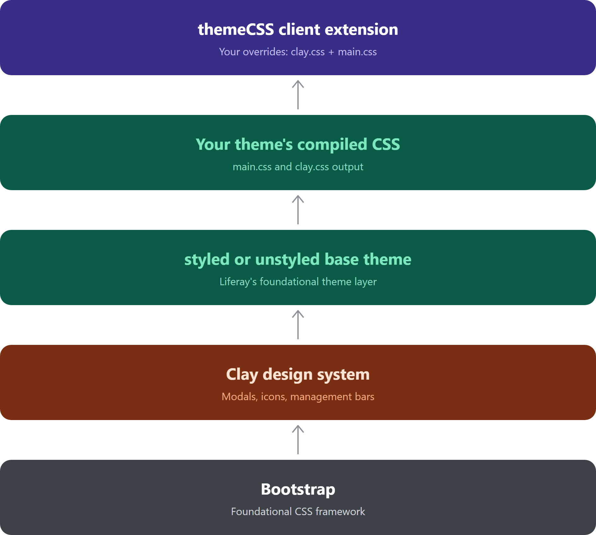
┌─────────────────────────────────────────┐
│  themeCSS Client Extension               │  ← Your overrides (clay.css + main.css)
│  (optional — replaces theme's own CSS)   │
├─────────────────────────────────────────┤
│  Your Theme's main.css / clay.css        │  ← What a custom theme normally provides
├─────────────────────────────────────────┤
│  styled or unstyled base theme           │  ← Liferay's foundational theme layer
├─────────────────────────────────────────┤
│  Clay (Liferay's design system)          │  ← Components: modals, icons, mgmt bars
├─────────────────────────────────────────┤
│  Bootstrap                                │  ← The foundational CSS framework
└─────────────────────────────────────────┘
Bootstrap sits at the base — it's the foundational framework providing grid systems, typography defaults, and utility classes. Clay, Liferay's own design component library, is built on top of Bootstrap and defines the specific components, layout structures, and visual language that make a site recognizably "Liferay" — modals, management bars, icon systems, and so on.
Every Liferay theme, whether it's out-of-the-box or fully custom, is ultimately built on one of two foundational base themes: styled or unstyled. A themeCSS client extension sits at the very top of this stack — when deployed, it doesn't add a new layer so much as it replaces the theme's own compiled output, while everything below it (Clay, Bootstrap) remains structurally in place.
styled vs. unstyled: Choosing Your Foundation
Every theme in Liferay — including one delivered via a themeCSS client extension — declares a base theme in its package.json:
{
  "liferayDesignPack": {
    "baseTheme": "styled"
  }
}
The two options behave very differently:
| Base Theme | What You Get |
|---|---|
unstyled |
Only the most essential base styles — minimal defaults, maximum control |
styled |
Everything in unstyled, plus the full set of default Liferay/Clay styling |
Practical guidance: Unless you're building a near-total custom visual identity from the ground up and want to avoid inheriting any default Liferay styling, start with styled. It ensures existing fragments, widgets, and out-of-the-box components continue to render correctly. Choosing unstyled means you're responsible for providing enough CSS to make every default component usable — a significant undertaking that's easy to underestimate.
The "Just Two URLs" Insight
Despite everything happening underneath — Bootstrap, Clay, SCSS compilation, base theme selection — a themeCSS client extension's client-extension.yaml configuration ultimately reduces to pointing at two compiled CSS files:
liferay-sample-theme-css-1:
  name: My Theme CSS
  type: themeCSS
  clayURL: css/clay.css
  mainURL: css/main.css
| Property | Purpose |
|---|---|
mainURL |
Path to the compiled main.css file |
clayURL |
Path to the compiled clay.css file |
mainRTLURL / clayRTLURL |
Optional right-to-left variants |
frontendTokenDefinitionJSON |
Optional path to a frontend token definition file, used with Liferay style books |
All the complexity of the SCSS build process, base theme inheritance, and Clay's component styling exists to produce these two files. Once compiled, Liferay only needs to know where to find them. This is a useful mental model: no matter how elaborate your SCSS setup becomes, the client extension's actual contract with Liferay stays this simple.
SCSS Internals: Where Your Styles Actually Live
If the YAML only points to compiled clay.css and main.css, where do you actually write your custom styles? Not directly in those files — they're build output.
Your custom styles belong in a _custom.scss file:
// src/css/_custom.scss

.button-custom a {
  background-color: #1a5f7a;
  color: white;
  border: none;
  border-radius: 5px;
  transition: background-color 0.3s;
}

.button-custom a:hover {
  background-color: #144a5f;
}
When you build the client extension, the theme CSS build process compiles this file — along with the rest of the theme's SCSS, including Clay's own component styles — into the final clay.css and main.css. This means your custom styles aren't bolted on afterward; they're woven into the same compiled output as the base theme and Clay components, which is part of why themeCSS produces such consistent, integrated results.
Important: If you have existing custom styles from an original theme that you're now replacing with a themeCSS extension, you need to explicitly bring those rules into _custom.scss. The client extension fully replaces the theme's compiled CSS — anything not carried forward simply won't be there anymore.
Import Conventions
When writing SCSS that needs to reference Clay's design tokens, mixins, or variables, your _custom.scss typically imports from Clay's Atlas package rather than redefining values from scratch:
@import "~clay-atlas/src/scss/_variables";

.button-custom a {
  background-color: var(--brand-color-1);
}
This convention keeps your custom styles aligned with Clay's design tokens (colors, spacing, breakpoints) instead of hardcoding values that could drift out of sync as Clay itself evolves. It also means your custom SCSS can reference the same variables that power Liferay's out-of-the-box components, producing a more visually cohesive result. If you'd rather work out a color system visually before committing it to SCSS variables, the Theme Color & Token Customizer can help you map out a palette against Clay's tokens first.
Application Scope: Where a themeCSS Extension Applies
A deployed themeCSS client extension can be applied at different levels, controlled primarily through the scope property:
| Scope | Applies To | Configuration |
|---|---|---|
layout (default) |
Individual site pages, as manually applied by an administrator | Default behavior — no scope property needed |
controlPanel |
All administrative pages (Site Menu, Global Menu, configuration screens) | Set scope: controlPanel in client-extension.yaml |
| Master pages / page templates | Any page using that master page or template | Applied through the page/template's configuration, not a YAML property |
| Individual pages | A single specific page | Applied via Site Menu → Pages → Configuration |
To determine whether a given page counts as "administrative" for controlPanel scope purposes, you can check in the browser console:
themeDisplay.isControlPanel()
// Returns true on admin pages, false on site pages
The scope property can only be set in a workspace-based, YAML-defined client extension. If you create a theme CSS client extension manually through the Liferay admin UI instead, it's always page-scoped and cannot be elevated to control panel or company-wide scope.
Draft/Publish Behavior and Theme Registration
This is one of the more surprising aspects of themeCSS for developers coming from simpler CSS client extensions: deploying a theme CSS client extension with style sheet resources triggers a new theme registration in Liferay.
In other words, once deployed, Liferay treats your client extension as a real theme — not a lightweight overlay. This has several practical consequences:
You can apply it like any theme — to master pages, page templates, or individual pages, exactly as you would a traditionally-built OSGi theme.
Changing a page's theme removes the extension. If a page already has a
themeCSSclient extension applied, and you subsequently change that page to a different theme, the client extension association is dropped. You'd need to reapply it if you switch back.Runtime loading mirrors legacy themes. When a page renders, Liferay loads the client extension's resources the same way it would load a traditional theme's resources — from the developer's perspective, this is functionally equivalent to the old plugin-based approach, just without the redeployment overhead for changes.
Publishing is required to see changes live. As with other client extensions, styling changes are visible while editing, but only take effect outside of Edit mode once the page is published.
Practical Walkthrough: Minimal Example
To ground the concepts above, here's what a minimal themeCSS client extension project looks like end-to-end.
Project structure:
client-extensions/
└── my-theme-css/
    ├── client-extension.yaml
    ├── package.json
    └── src/
        └── css/
            └── _custom.scss
package.json:
{
  "name": "@myproject/my-theme-css",
  "version": "1.0.0",
  "main": "package.json",
  "liferayDesignPack": {
    "baseTheme": "styled"
  }
}
src/css/_custom.scss:
.button-custom a {
  background-color: #1a5f7a;
  color: white;
  border-radius: 5px;
}

.button-custom a:hover {
  background-color: #144a5f;
}
client-extension.yaml:
assemble:
  - from: build/buildTheme/img
    into: static/img
  - from: build/buildTheme/images
    into: static/images

my-theme-css:
  name: My Theme CSS
  type: themeCSS
  mainURL: css/main.css
  clayURL: css/clay.css
The assemble block ensures any images referenced by the base theme's CSS (icons, backgrounds) are carried into the deployable package as static resources — without this, the compiled CSS could reference image paths that don't exist in the final bundle.
Build and deploy:
./gradlew clean deploy
Apply to a page:
- Edit the target page and click the Edit icon.
- Open Page Design Options → Configuration.
- Scroll to the Theme CSS Client Extensions section.
- Click Add, and select your deployed extension.
- Save, then publish the page.
Decision Table: themeCSS vs. globalCSS
| Question | Choose globalCSS |
Choose themeCSS |
|---|---|---|
| Are you making a handful of targeted style tweaks? | ✅ | |
Do you need to override the theme's own main.css/clay.css comprehensively? |
✅ | |
| Do you want changes to apply regardless of active theme? | ✅ | |
| Are you building a systematic, brand-wide visual identity? | ✅ | |
| Do you need SCSS compilation, Clay token access, or style book integration? | ✅ | |
| Is a single CSS file with a few rules sufficient? | ✅ | |
| Do you need the extension to behave like a real, selectable theme? | ✅ |
If you're unsure, start with globalCSS. It's simpler to deploy, easier to reason about, and doesn't trigger theme registration. Move to themeCSS only once you find yourself fighting the theme's own styles rather than simply adding to them. If you're building the theme from scratch rather than layering onto an existing one, the Liferay Theme Builder Wizard can scaffold the base _clay_variables.scss and layout files this workflow builds on.
Summary
A themeCSS client extension isn't just "CSS that applies to a theme" — it's a full participant in Liferay's layered styling system, sitting on top of Bootstrap and Clay, built from a styled or unstyled foundation, compiled via SCSS into exactly two files (main.css and clay.css), and registered with Liferay as a genuine theme once deployed.
Understanding this layer cake — rather than treating themeCSS as a black box — makes several previously confusing behaviors self-evident: why changing a page's theme removes your extension, why conflicts always resolve in the extension's favor, why _custom.scss is where your work actually lives, and why the choice between styled and unstyled has such outsized consequences for how much you need to build yourself.
References
This article draws on the following official Liferay Learn documentation:
- Using a Theme CSS Client Extension — Customizing Liferay's Look and Feel, Liferay Learn
- Theme CSS YAML Configuration Reference — Liferay Learn
- Mastering Liferay Frontend Client Extensions: Modifying Site Appearance — Course module, Liferay Learn
- Customizing Liferay's Look and Feel — Overview, Liferay Learn
- Using a CSS Client Extension — Liferay Learn
- Working with Client Extensions — Liferay Learn
Related Reading
- Creating Your First Client Extension: A Step-by-Step Tutorial (globalCSS) — the simpler, additive CSS client extension this article contrasts
themeCSSagainst. - Creating Your First Client Extension: A Step-by-Step Tutorial (globalJS) — the JavaScript counterpart in the same client extension family.
- Liferay Theme Builder Wizard — scaffold a full 7.4/DXP theme's layout, color system, and typography.
- Theme Color & Token Customizer — work out a Clay-aligned color palette before writing
_custom.scss. - Browse all Liferay tools — generators and reference utilities for Liferay developers.